
Tesla Logo - Story, Meaning and Evolution
The Tesla logo has become one of the most recognizable symbols in the automotive industry, representing innovation, sustainability, and cutting-edge technology. But what lies behind this sleek, minimalist design? The story of Tesla's logo evolution reveals fascinating insights into the company's brand identity and its connection to the brilliant inventor whose name it bears.
The Genesis of Tesla's Visual Identity
When Elon Musk and his co-founders established Tesla Motors in 2003, they needed a logo that would embody their revolutionary vision for electric vehicles. The challenge was creating a symbol that would honor Nikola Tesla's legacy while projecting modernity and technological advancement.
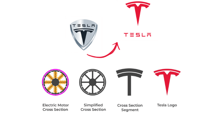
The original Tesla logo featured a distinctive shield-like emblem with the company name positioned prominently below. This early design established the foundation for what would become one of the automotive industry's most iconic brand marks.
Decoding the Tesla Logo: Hidden Meanings and Symbolism
The "T" That's More Than a Letter
The most striking element of the Tesla logo is its stylized "T" symbol, but this design carries deeper significance than a simple initial. According to Tesla's design team, the logo represents a cross-section of an electric motor - specifically, the stator and rotor components that power Tesla's vehicles.
The curved top portion symbolizes the stator (the stationary part of the motor), while the vertical line represents the rotor (the rotating element). This ingenious design choice connects the logo directly to Tesla's core technology, making it both aesthetically pleasing and functionally meaningful.
Shield Design Philosophy
The shield-shaped background serves multiple symbolic purposes:
- Protection: Representing Tesla's commitment to vehicle safety and advanced safety features
- Heritage: Connecting to automotive tradition while pushing boundaries
- Strength: Conveying the durability and reliability of Tesla's engineering
- Premium Quality: Establishing Tesla as a luxury automotive brand
The Evolution Journey: From Complex to Minimalist
Phase 1: The Original Shield Era (2003-2017)
Tesla's initial logo featured a more elaborate design with:
- A detailed metallic shield background
- Bold "TESLA" lettering beneath the emblem
- Chrome-like finishing that emphasized luxury positioning
- Complex shading and dimensional effects
This version established Tesla's brand recognition but proved challenging for digital applications and smaller formats.
Phase 2: The Simplified Revolution (2017-Present)
Recognizing the need for better scalability and modern appeal, Tesla underwent a significant logo refinement:
- Streamlined Design: Removed complex shading and dimensional effects
- Improved Scalability: Enhanced visibility across digital platforms and small formats
- Monochromatic Flexibility: Enabled better application across various backgrounds
- Contemporary Aesthetics: Aligned with current design trends favoring minimalism
You may also like to read: Best Motorcar Logos of All Time
The Nikola Tesla Connection: Honoring a Visionary
The company's name and logo pay homage to Nikola Tesla (1856-1943), the Serbian-American inventor whose groundbreaking work in alternating current (AC) electrical systems laid the foundation for modern electric power distribution. Tesla's contributions to electrical engineering make him the perfect namesake for a company revolutionizing electric transportation.
Key connections between the inventor and the brand:
- Both focused on electrical innovation
- Both challenged conventional thinking
- Both aimed to improve human life through technology
- Both faced skepticism before achieving recognition
Logo Application and Brand Consistency
Tesla maintains strict brand guidelines for logo usage across:
Vehicle Integration
- Hood emblems
- Steering wheel centers
- Charging port covers
- Wheel center caps
Digital Platforms
- Website headers
- Mobile applications
- Social media profiles
- Marketing materials
Retail and Infrastructure
- Supercharger stations
- Tesla stores and service centers
- Corporate communications
- Merchandise and accessories
Psychological Impact and Brand Recognition
The Tesla logo's effectiveness stems from several psychological principles:
Visual Memory
The simple, distinctive shape creates strong visual memory associations, making it instantly recognizable even at small sizes or quick glances.
Premium Perception
The clean, minimalist design conveys sophistication and premium quality, supporting Tesla's luxury market positioning.
Innovation Symbolism
The motor cross-section representation reinforces Tesla's identity as a technology-first company, differentiating it from traditional automakers.
You may also like to read: Ford Motor Logo Over Time
Competitive Landscape and Industry Impact
Tesla's logo design philosophy has influenced the broader automotive industry's approach to branding:
- Minimalist Trend: Many brands have simplified their logos following Tesla's lead
- Technology Focus: Increased emphasis on logos that convey innovation
- Digital Optimization: Greater attention to how logos perform across digital platforms
- Sustainability Messaging: Enhanced focus on environmental responsibility in brand imagery
The Future of Tesla's Visual Identity
As Tesla expands beyond automotive into energy storage, solar panels, and autonomous driving, the logo's versatility becomes crucial. The current design's flexibility allows for:
- Cross-Industry Application: Suitable for diverse product categories
- Global Recognition: Cultural neutrality enabling worldwide brand expansion
- Technology Evolution: Adaptable to emerging technologies and platforms
- Brand Extension: Compatible with sub-brands and product variations
Marketing and Brand Value Impact
The Tesla logo contributes significantly to the company's estimated brand value of over $75 billion. This visual identity supports:
Customer Loyalty
The recognizable symbol creates emotional connections with Tesla owners and enthusiasts.
Premium Pricing
The sophisticated design justifies Tesla's premium pricing strategy in the electric vehicle market.
Social Status
The logo serves as a status symbol, particularly among environmentally conscious consumers.
Viral Marketing
The distinctive design enhances social media sharing and word-of-mouth marketing effectiveness.
Design Lessons for Modern Brands
Tesla's logo evolution offers valuable insights for contemporary brand design:
- Functional Symbolism: Incorporate meaningful elements that connect to your core business
- Scalability First: Design for digital-first environments and multiple applications
- Evolutionary Approach: Refine gradually rather than completely redesigning
- Cultural Sensitivity: Create designs that work across global markets
- Future-Proofing: Consider how your logo will adapt to business expansion
Conclusion: A Symbol of Transformation
The Tesla logo represents more than just a company identifier - it embodies the transformation of an entire industry. From its origins as a tribute to a visionary inventor to its current status as a symbol of sustainable transportation, Tesla's logo continues to evolve while maintaining its core identity.
As Tesla pushes the boundaries of electric vehicle technology, autonomous driving, and clean energy, its iconic logo serves as a constant reminder of the company's mission to accelerate the world's transition to sustainable transport. The thoughtful design choices behind this seemingly simple symbol demonstrate how effective branding can reinforce company values while building lasting customer connections.
The Tesla logo story illustrates that successful brand design requires more than aesthetic appeal - it demands meaningful symbolism, strategic thinking, and the flexibility to evolve with changing times while honoring foundational principles.


